Where did my time go? Expectations vs Reality

Context: I’ve been interested in self tracking for a while and have been doing it to varying degrees since 2015. I’d like to make it a more automated process so I can have a more consistent and comprehensive log. I’ve made a decent amount of progress in the last couple of months, but would really like to move this project further along and know there’s nothing like a deadline to make things go faster.

Goals: One of the things I hope to learn from my data is where my time goes, particularly when I am working on a specific project or learning something new. I have a general grasp of what I spend my time on, but I think it is skewed by what I want it to be/recency bias rather than what it actually is. I am also hoping that I can identify some patterns and course correct so I can be more productive as well as be a bit more realistic about what I can accomplish in a short period of time.

Time Spent: Since I downloaded the aTimeLogger app for tracking my offline time or adding more tags to my online data last year, I have tracked 32 hours for just this project, which I refer to as My Data Diary (with 28 hours just this year, so I can see the July deadline is already working!).

Progress: So far, the main part of this sub-project (how I learn x) has been getting the data from the apis and munging the data to a format that would work for my visualizations, linking my activity data with my logs (aTimeLogger and RescueTime), and trying out different charts. I’ve written a few helper functions to speed up my analysis and automate some of the visualizations, but they could definitely be more robust.

A case study: A consultancy project I worked on for a week back in December. I was pretty good about tracking my time for this project as well as projecting how long it would take me, so I thought it would be a good starting point for further exploration.
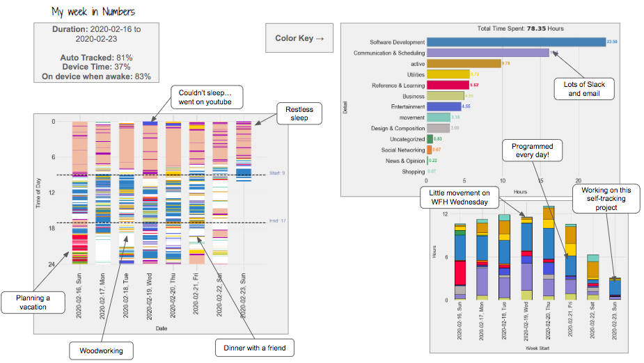
Summary of my time:

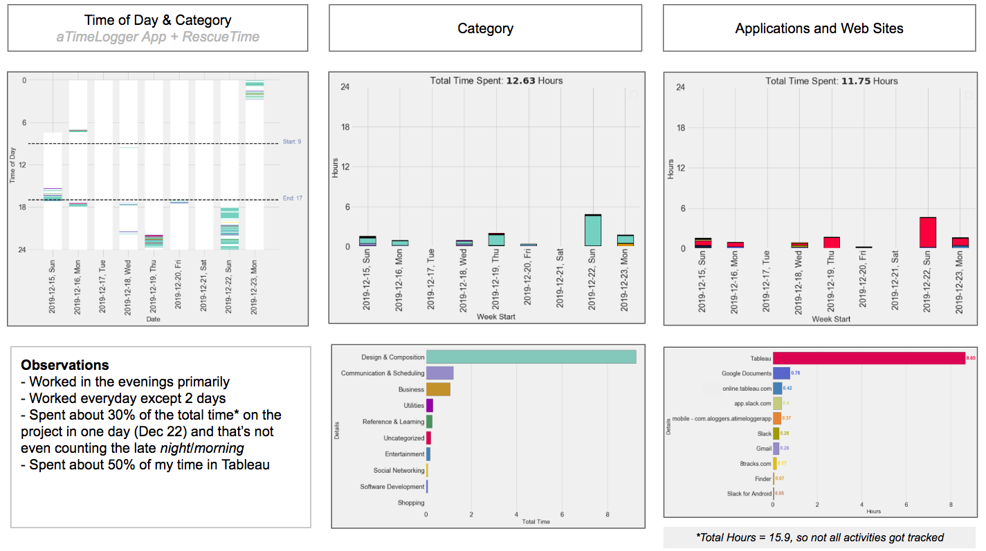
Takeaways: (+ thoughts about what I could do better next time)

  • Can you guess when the project deadline was? I thought I was doing a good job making progress… worked on this project almost every day. (Maybe I can try setting a halfway deadline?)
  • I initially had plans to work on this project in the evenings AND mornings instead of just evenings. (I could definitely improve by getting a couple more sessions in in the morning.)
  • There’s no surprise what application I spent most of my time in since the project was to make a couple Tableau dashboards for investors, what is surprising is how much time I spent in other applications. (I didn’t do a super good job estimating time for other aspects of the project aside from building the actual dashboard.)
  • I was particularly interested to see how much time I spent communicating and scheduling since this was a new project. I was surprised how little I spent on this. (I guess all of our calls/check-ins were more efficient than I expected.)

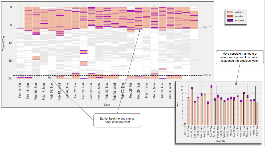
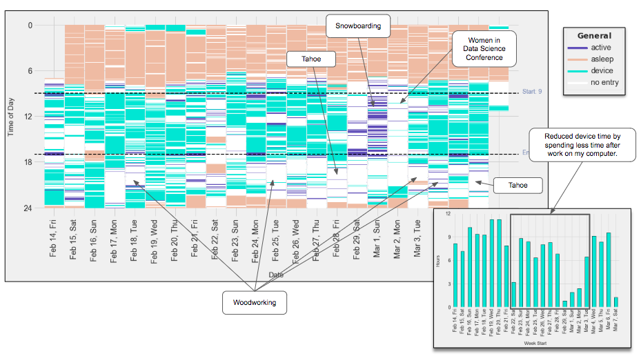
Next Steps: I am really curious what I “gave up” that week in order to complete this project. Definitely some sleep! What were my previous evenings like and was this a “better” use of my time. I’d also like to try this type of reflection with a work week to see where my time is going and perhaps make some tweaks.

Questions for You: If you have made it this far and aren’t too tired from the long post, I’d love to hear your feedback, especially about the visualizations. What suggestions do you have on how I can improve them? Are there any parts that are confusing? Do you have any other recommendations as to how to visualize the information differently? What other data would be interesting to have tracked/visualized for this case study?

An Aside: Interestingly enough, it wasn’t until I set down to write down my learnings from my charts for this post that I actually had that many takeaways!

2 Likes

Hah, ouch, yeah – it looks like you had to stay up late to get it done by Monday morning.

It’s not a very deep feedback, but I think the y axes for the top middle & right graphs aren’t really benefiting from the 24 hour format – since it’s not displaying which times of day, and it’s harder to see the stacked data when it’s squished like that.

the bottom right has separated data for different slack apps – would you consider that a data artifact?

Yea Friday night/early a.m. was crunch time haha

y axes for the top middle & right graphs aren’t really benefiting from the 24 hour format

I wasn’t sure what scale to use here. I wanted to keep the same y scale as the one on the left so it would be faster to read the charts from left to right and digest the data, but I think that the bar heights are so small that you actually end up losing information. Thanks for the suggestion, I’ll modify for next time :slight_smile:

bottom right has separated data for different slack apps

Ah yes, good eye! Some more data cleaning is required.

Thanks for sharing insights and visualizations, it’s really cool! As @madprime has pointed out, the top middle/right graphs would really benefit from not sticking to the 24h format to allow a better resolution. The different Slack apps showing up are a result of how RescueTime etc track their applications. I personally wouldn’t necessarily say it’s an artifact, as it’s still interesting to see how e.g. Slack on Android is different from Slack on your computer. Plus: The larger categories (bottom middle) help to aggregate by categories quite a lot.

For what further visualizations are interesting: I think it would be really interesting to compare these project-based graphs to the background/baseline of what you ‘usually’ do. Taken by itself I always found it hard for my own data to get a feeling for how my behaviour is different from the ‘normal’ or ‘average’. What do you think? :slight_smile:

Thanks Bastian for your suggestions, next iteration will have an updated y-axis for the the two right charts (I actually had that originally and changed it at the very last second). I am not sure why I see three Slacks tho :confused:

Oh yes, definitely agree that it would be interesting to compare to some sort of baseline. I am actually currently working on cleaning up my sleep and step data from Fitbit to get a more holistic view of my weeks so I can measure what the norm is.

This is because you used ‘different’ applications for accessing Slack. I assume that app.slack.com is when you’re accessing Slack in your web browser, Slack when using the dedicated Slack app on your computer and Slack for Android when you’re using it on your phone. RescueTime (based on my own experience using it) can’t combine them as those are different apps.

If you want to combine them you can make sure that their category/sub-category are properly set and identical in RescueTime (e.g. communication/scheduling: instant messaging), so you can use that sub-category for aggregating it?

Thank you Bastian, I don’t think I was super clear in my confusion about the different Slacks, I don’t remember using all three (just two of those), so I was confused by why three appeared – I guess this goes inline with Expectations vs Reality haha. I will check how it is being triggered though.

1 Like

Maybe browser Slack vs. using the desktop app?

Ah, okay, that makes sense! :slight_smile:

Update

Progress: I made good traction on getting my RescueTime and my Fitbit sleep & step data to work nicely together to show a more comprehensive log of my day to day (previously I had these two living separately). This aggregate view/combined data will hopefully give me a better sense of how my weeks look and eventually answer the question of: Whether a given week was “different” from the other weeks and what was different about it (I’d like to answer my earlier post about my consulting project and what I ‘gave up’ in order to finish the project).

A case study: I reloaded my notebook every couple of days to monitor where my time was going. I could tell a story by looking at the gaps of data (when I was offline) as well as the long stretches of time doing one type of task. One major thing that I noticed the week I was closely monitoring my activity was how erratic my sleep was.

Changes in behavior: I made a consorted effort to go to bed early the following week, I had several migraines week 1, which I think were triggered by a lack of sleep and a lot of computer time (I spent a couple of days with almost 12 hours on a device!).

Summary of my time:

Week 1 (super detailed view)

Weeks 1-3 (zoomed out and focused on seeing progress on my time management goals)


Observations

  • I was really motivated to go to bed early and told my partner (who is a night owl) that I was going to try having a more regular sleep schedule. He was pretty supportive and even modified his sleep schedule to go to bed earlier. I am pleased to say that I was able to significantly improve the consistency in my sleep schedule :slight_smile:
  • To no surprise, I felt like I required a lot less coffee to function the next day. I did expect that my migraines would go away immediately after a week of good sleep, but I think there were other factors at play (stress? hormones?).
  • Not shown here, I got a lot of progress on this self tracking project the first week, and not so much the next two weeks… there’s always a tradeoff (I wish there were 36 hours in a day!).
  • Device time is hard, since I am on the computer at work and for personal projects. However, I can certainly be better at spending fewer hours on youtube and pointlessly scrolling through Twitter.
  • I could definitely do a better job being more active during my work from home days… I’ll try this as a goal for next week.

Next steps:

  • Create the rules for overlaying the aTimeLogger data, which are manually entered. It would be awesome to automatically overlay the comment bubbles.
  • Long term goal is to get GPS data in here as well which I think will get lots of ‘offline’ time. If anyone has recommendations/code for extracting google maps data, I would love your help/advice.
  • I’d like to post the python notebook and accompanying helper functions I wrote on github with a Readme so someone else can more easily re-use the code.
2 Likes